Classroom Experiment: Can Students Fool a Biostatistician? A Data Fabrication Contest
By Maicel Monzon
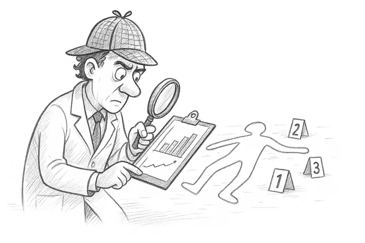
Act I: The Experiment
The moment they knew they had lost
At 11:07 in the morning, in the postgraduate classroom at the University of Medical Sciences of Havana (UCMH), The Confident One dropped her pen.
On the projector screen, the histogram of her data showed an unusual pattern. Her hemoglobin values —42 numbers carefully invented using her knowledge of human physiology— a had just been exposed as fake.
Next to her, The Cautious One stared at her own verdict: an inexplicable variance.
The Enthusiastic One, who had written 50 values in 60 seconds betting on quantity over quality, wore the expression of someone who had just discovered that her strategy was the least bad.
It had all started half an hour earlier with a simple instruction:
What they didn’t know is that humans are terrible at inventing data. Not because we’re honest, but because our brain produces predictable errors when generating apparently random data.
And I had exactly the tools to find them.
The Suspects and Their Alibis
Before the autopsy, let’s meet our participants—medical residents in basic sciences (physiology, embryology, pharmacology, etc.) who were taking the course “Research Methodology and Statistics” during the 2022-2023 academic year:
| Participant | Declared Strategy |
|---|---|
| Luidmila (The Cautious One) | “I’m going to stay in the safe range, nothing too extreme.” |
| Betsy (The Enthusiastic One) | “I’m going to write lots of numbers to make it look more real and win by volume.” |
| Melissa (The Confident One) | “I know physiology. This is going to be easy.” |
The Crime Scene: Lots of Blood
There was a lot of blood at the scene… or at least one of its components: Hemoglobin.
It’s a vital protein in cellular respiration, but here we’re not interested in its biology—we’re interested in its statistical behavior.
Because for a lie to be believable, you first need to know the truth:
Reference values for blood hemoglobin concentration (adult woman) in g/L
| Parameter | Population Value |
|---|---|
| Normal range (min-max) | 121 – 151 g/L |
| Population mean | 136 g/L |
| Standard deviation | 7.5 g/L |
Armed with this knowledge—or their vague memory of it—the participants furiously wrote down all the figures they could in their Excel files for 60 seconds.
Act II: The Statistical Autopsy (The 5 Tests)
First Test: Anchoring (The Mean)
Let’s start with the easy part. Does the arithmetic mean of the invented dataset resemble the real value?
| Participant | Values | Arithmetic Mean | Estimation Error |
|---|---|---|---|
| La Confiada | 18 | 119.4 | -16.6 |
| La Entusiasta | 50 | 125.9 | -10.1 |
| La Prudente | 42 | 125.3 | -10.7 |
| note: Estimation Error = Estimated Parameter (Arithmetic Mean (Hb g/l)) - Population Parameter (Hb: 136 g/l) |
Result
Why does this happen?
Without a numerical reference, the clinician doesn’t estimate values from a statistical distribution but rather relies on learned diagnostic categories (“mild anemia,” “normal”). Under time pressure, this cognitive mechanism favors a conservative judgment: when in doubt, it’s more prudent to underestimate hemoglobin—attributing it to mild anemia—than to overestimate it and suggest a less frequent condition, such as polycythemia.
However, when the population mean (136 g/L) is shown, the estimate adjusts almost immediately. The mean then acts as a clear and easy-to-imitate reference point, allowing for more precise calibration of judgment.
Second Test: Texture (Variability)
Here we arrive at the first crucial finding: they failed to simulate the standard deviation (SD), even when the real value (7.5 g/L) was right in front of them.
The mean is easy to correct; the standard deviation is not. Let’s examine what happened in detail.
| Participant | sd | min | max | Estimation Error |
|---|---|---|---|---|
| La Confiada | 10.0 | 102 | 134 | 2.5 |
| La Entusiasta | 13.4 | 102 | 152 | 5.9 |
| La Prudente | 9.7 | 103 | 141 | 2.2 |
Resultado
Curiously, unlike the mean (where they fell short), here everyone exaggerated variability.
The Enthusiastic One generated considerable chaos (SD 13.4 g/L), stretching the data from 102 g/L to 152 g/L.
The Confident One and The Cautious One missed the target by inflating the deviation, but with a revealing pattern: The asymmetry of fear.
Observe their ranges: they weren’t afraid to go down to 102 g/L or 103 g/L (far from the normal floor of 121 g/L), but they barely dared to go up to 134 g/L or 141 g/L (far from the upper limit of 151 g/L).

By stretching the distribution to the left (inventing severe anemias) but shortening it to the right (avoiding high values), they created an unnatural dispersion.
Why does this happen?
The figure shows that the colored curves are wider and more twisted than the theoretical normal distribution in black (SD = 7.5 g/L), with long tails toward severe anemias (102-103 g/L) but short tails for high values (up to 134-141 g/L). This “asymmetry of fear” inflates the SD, showing how participants prioritized clinical biases over the laws of chance (Law of Large Numbers).
The standard deviation isn’t a fixed number but an elusive “texture”: even if you see “7.5,” the brain struggles to evoke its tails, dispersion, and amplitude.
They failed by imposing their medical perception—“common anemia (down to 102 g/L), rare polycythemia (brake at 134 g/L)"—valid in clinics but fatal for faking a balanced and symmetrical normal curve.
A note of fairness for the participants:
To be fair, with the exception of the chaos generated by The Enthusiastic One, the others achieved clinically tolerable estimates. Their errors (2-3 g/L) fall within normal biological variation or typical measurement error. In a hospital, this data wouldn’t kill anyone; but in a forensic audit of their theses, they’re indelible fingerprints.
Third Test: The Last Digit (The Trail of Chaos)
This is my favorite test. To understand it, let’s think about a hemoglobin of 136 g/L. That number has two parts:
1. The beginning (13.):The first two digits obey biology—the bone marrow, metabolism, iron. There is order.
The ending (..6)): The last digit belongs to chance—a glass of water, a breath, a vibration. There is randomness.
In that stochastic component, all digits from 0 to 9 should have the same probability: 1/10, meaning 10% each.
Any sustained deviation from that 10% leaves a trace: the trail of human bias.
| Digit | The Confident One | The Enthusiastic One | The Cautious One |
|---|---|---|---|
| 0 | 11.1% | 8% | 16.7% |
| 1 | 5.6% | 4% | 9.5% |
| 2 | 16.7% | 22% | 16.7% |
| 3 | 11.1% | 6% | 11.9% |
| 4 | 16.7% | 2% | 4.8% |
| 5 | 0% | 14% | 9.5% |
| 6 | 11.1% | 12% | 0% |
| 7 | 5.6% | 12% | 11.9% |
| 8 | 5.6% | 12% | 9.5% |
| 9 | 16.7% | 8% | 9.5% |
We can see it better in red. The bars that shoot up are the “fingerprints of the crime”:

Resultado
To evaluate this, we use two detectors: Mean Deviation (how much they err in general) and Frequency of 0 and 5 (how much they rounded for convenience).
| Participante | Desv. Media | Frecuencia 0 y 5 | Evaluación |
|---|---|---|---|
| La Confiada | 4.7% | 11.1% | Sospechoso: Evitación Artificial |
| La Entusiasta | 4.4% | 22.0% | Sospechoso: Patrón Irregular |
| La Prudente | 3.4% | 26.2% | Sospechoso: Exceso de Redondeo |
The Cautious One (The Lazy Brain: Fell into the rounding trap. Her digits 0 and 5 add up to 26% (the natural rate is 20%). When inventing data, her brain unconsciously sought “round” numbers.
The Enthusiastic One (The Anchoring): Tried to be creative but became obsessed with one number. Observe her peak at digit 2 (22% frequency) and the near disappearance of 4. She replaced an obvious pattern with a hidden one.
The Confident One (The Overacting): The opposite of The Cautious One. Her use of 0 and 5 is suspiciously low (~11%). By trying to avoid round numbers to “seem more random,” she ended up generating an artificial avoidance pattern.
Why does this happen?
The human brain seeks cognitive comfort or tries to outsmart the system. Inventing pure randomness consumes a lot of energy, and we usually fail in two ways:
Rounding (The Cautious One’s case): When in doubt, the brain prefers easy milestones (0, 5, even numbers) to process information quickly.
Avoidance (The Confident One’s case): We mistakenly believe that randomness shouldn’t have patterns or round numbers. By avoiding putting a “0” or a “5” because it seems “too exact,” we break the natural uniformity of chaos.
Fourth Test: Benford’s Ghost (The Order of Beginnings)
If the last digit is chaos, the middle ones are structure. Although strict Benford’s Law requires wide ranges, its basic principle remains: nature disperses, humans concentrate.
In a real group of people, we would see varied hemoglobin levels: from 118 (mild anemia) to 165 (athletes or people living at high altitude). There would be a wide distribution.
What did our participants do? They took refuge in the center.

Resultado
The participants created an artificial mountain in the tens digits 3 and 4 (values from 130 to 149).
- Center inflation: Almost all data clusters in 130-140.
- Fear of extremes: They almost completely eliminated low values (120s) or high values (150s-160s), which are biologically normal.
Why does this happen?
Because of the Centrality Bias.
The brain of The Cautious One (and the others) interprets that the mean (136) is “correct” and that deviating from it is “risky.”
Nature produces diversity (wide curve).
The liar seeks safety (narrow and peaked curve).
Inventing a value like “121” or “168” seemed dangerous to them, so they all copied the same strategy: “Put something in the middle, around 130-something, and nothing will happen.” By all doing it at once, the artificial pattern became evident.
Fifth Test: The Shape of the Lie – Kurtosis and Skewness
The final look is at the complete “silhouette” of the data. Two parameters betray us:
Kurtosis (Peakedness: How peaked is the curve? (Indicates fear of deviating from the center).
Skewness (Bias): Which way does the curve lean? (Indicates clinical prejudices, like “it’s better to include anemias than polycythemias”).
I’ve superimposed the curves of the three residents over the Real Biology (Gray Shadow). The differences are telling.

Resultado:
In the figure:
The Reference (Solid black line): This is the theoretical normal curve, a smooth hill centered at 136 g/L. It naturally extends between the clinical limits (121-151 g/L, dotted lines), accepting real biological variability.
The Confident One (Blue line): It’s a needle! Shows extreme Leptokurtosis. Her curve is the highest and narrowest of all, concentrating almost all her values in a minimal range around 130-140 g/L. By trusting her theoretical knowledge, she became “paralyzed” at the center. It’s the graph of counterproductive perfectionism.
The Cautious One (Green line): It’s a deformed camel. Her curve shows Negative Skewness, clearly melting toward the left (values of 100-120 g/L). Her strategy of “staying in the safe range” led her to invent too many moderate anemias, creating an evident pathological bias.
The Enthusiastic One (Red line): The imitator. She’s the only one whose curve reasonably follows the shape of the normal bell, although somewhat narrower. Her “brute force” strategy (writing fast without overanalyzing) turned out to be the most effective for emulating natural randomness.
Why does this happen?
Because simulating Normality is abnormal for the brain.
Either we’re too precise (The Cautious One compresses the data).
Or we’re too prejudiced (The Confident One biases the data toward pathology).
Nature is symmetric and dispersed. Humans are biased and fearful.
Sixth Test: Runs Test
The six previous tests were the interrogation. They gave us strong suspicions (the SD, the rounding), but we needed the forensic DNA evidence to confirm human intervention.
This is where the Runs Test comes in.
This test is an implacable detective. It doesn’t care about the specific value of the data (whether it’s 135 or 145); it only cares about the sequence.
How does it work?
- Median Cut: The test ignores the values and only looks at whether each data point is above (+) or below (-) the median (the central value).
2.Runs: It counts how many times there’s a sign change (e.g., + + - - - + has three runs: ++, —, +).
Few Runs (Clustering): Indicates a tendency for values to cluster (e.g., + + + - - -), suggesting laziness or a slow pattern.
Many Runs (Alternation): Indicates that values go up and down too quickly (e.g., + - + - + -), suggesting that the person is forcing randomness.
Z-Score Verdict: The Z-Score tells us whether the observed number of runs deviates from what we would expect by pure chance.
| Participant | Z-Score |
|---|---|
| La Confiada | 0.00 |
| La Entusiasta | -1.71 |
| La Prudente | -0.81 |
Result
The threshold for declaring data “Non-Random” is |Z| > 1.96. Although only The Enthusiastic One was close to the threshold (-1.71, due to clustering), the most revealing result was The Confident One’s:
The Confident One (Z-Score = 0.00): Statistics didn’t declare her “Non-Random”; it declared her “Too Perfect.” A Z-Score of zero means that the number of observed runs was exactly equal to the number of runs that theory predicts for randomness. In real data, this is almost impossible. It’s the definitive proof that she consciously tried to alternate her values above and below the median to appear random.
The Enthusiastic One (Z-Score = -1.71): Her negative Z-Score suggests too few runs (tendency to cluster values). Her brain, writing quickly, fell into the common pattern of cognitive laziness.
Why does this happen?
The reason is simple and terrifying:
The Negative Alternation Bias: When asked to create a random sequence (like flipping a coin 100 times), we instinctively avoid long runs. The brain thinks: “it can’t come up ‘Heads’ six times in a row, that doesn’t seem random.” So, we force a change (from ‘Heads’ to ‘Tails’).
The Result: By forcing the change, we create too many alternations (or too many runs) than probability allows, or, in The Confident One’s case, a number of runs so perfect that it betrays conscious overcorrection.
Act III: The Verdict
A necessary parenthesis: When pressure breaks ethics
Before crowning the winners, we need to get serious for a moment. Today’s experiment—forcing them to fabricate data in 60 seconds—wasn’t accidental. It was a simulation of reality.
In my research published in the Revista Habanera de Ciencias Médicas, “Causas de investigación científica cuestionable…”,I documented that pressure (to publish or pass) is one of the determining factors that push researchers toward misconduct, along with lack of knowledge.
Today we played “data fabrication” as a reverse engineering pedagogical tool. But make no mistake: outside this controlled exercise, fabricating or falsifying results is a serious breach of scientific integrity. As I concluded in my study, data fabrication is a present shadow that we must combat with education and honesty.
Understanding how lies are told is the first step toward defending the truth.
That said… let’s see who succumbed best to pressure.
After this analysis, we proceed to the award ceremony.
🏆 The Pinocchio Awards 2023
🥇 Golden Pinocchio: The Enthusiastic One
For: Lying by volume.
Verdict: Her strategy of writing quickly created so much chaos that, ironically, it disguised some patterns. She won by brute force, not by skill.
🥈 Silver Pinocchio: The Confident One
For: Overacting.
Verdict: She knew too much physiology. By consciously trying to avoid zeros and fives, she created randomness so perfect that it was impossible.
🥉 Bronze Pinocchio: The Cautious One
Por: Cognitive laziness.
Verdict: She rounded everything and stayed in the center. It’s the easiest fraud to detect.
Epilogue: The Three Laws of the Numerical Liar
The center is easy, the extremes are scary: Anyone can invent an average; no one dares to invent marginal values (outliers).
Randomness is uncomfortable: The brain avoids repeating numbers and patterns, but true chance loves repetitions (clusters).
Round numbers are a trap: In stressful situations, 0 and 5 are irresistible magnets.
The next time you review a paper and the data seems “too clean,” remember:
Real data is uncomfortable, unpredictable, and sometimes ugly
If everything looks perfect, someone probably perfected it
This post is linked to other texts in the Classroom Experiments series:
“Classroom Experiment: The Day Silicon Gave Me the Nobel Prize”.
Additional Resources
Here are the materials to reproduce the forensic analysis in RStudio:
- 💾 Raw Data: Download experimento.csv
- 💻 Audit Script: Download analisis.R
Become a Data Detective!
Don’t just stay with the theory. These forensic techniques can save you from basing your research on fraudulent data. Now it’s your turn to apply them!
💬 Your Experience as a Detective
The community grows when we share real cases. I’d love to read your comments!
Have you ever detected suspicious data in theses or papers you’ve reviewed?
Which forensic technique did you find most useful for validating data authenticity?
Share your most intriguing case - how you became suspicious and what technique gave you the definitive proof.
Bring Forensic Statistics to Your Next Scientific Review
Subscribe to bioestadísticaedu and receive directly in your inbox:
- Software for fabricated data training
References
Jameson, J. L., Fauci, A. S., Kasper, D. L., Hauser, S. L., Longo, D. L., & Loscalzo, J. (Eds.). (2018). Harrison’s Principles of Internal Medicine (20th ed.). McGraw-Hill Education.
Benford, F. (1938). The Law of Anomalous Numbers. Proceedings of the American Philosophical Society, 78(4), 551–572.
Brown, N. J. L., & Heathers, J. A. J. (2017). The GRIM Test: A Simple Technique Detects Numerous Anomalies in the Reporting of Results in Psychology. Social Psychological and Personality Science, 8(4), 363–369. https://doi.org/10.1177/1948550616673876
Carlisle, J. B. (2017). Data fabrication and other reasons for non-random sampling in 5087 randomised, controlled trials in anaesthetic and general medical journals. Anaesthesia, 72(8), 944–952. https://doi.org/10.1111/anae.13938
Heathers, J. A. J., & Brown, N. J. L. (2019). SPRITE. PsyArXiv. https://psyarxiv.com/9qfr5/
Mosimann, J. E., Wiseman, C. V., & Edelman, R. E. (1995). Data fabrication: Can people generate random digits? Accountability in Research, 4(1), 31–55. https://doi.org/10.1080/08989629508573866
Nigrini, M. J. (2012). Benford’s Law: Applications for Forensic Accounting, Auditing, and Fraud Detection. John Wiley & Sons.
Simonsohn, U. (2013). Just Post It: The Lesson from Two Cases of Fabricated Data Detected by Statistics Alone. Psychological Science, 24(10), 1875–1888. https://doi.org/10.1177/0956797613480366
Wald, A., & Wolfowitz, J. (1940). On a test whether two samples are from the same population. The Annals of Mathematical Statistics, 11(2), 147–162.